 Peter Founder
Case Study: Just One Extra Question, Why Did It Earn 18% Less?

Case Breakdown · Issue 6
Hi, I’m Peter.
This issue’s cases come from the official ProPush blog: 6 real cases where affiliates edited their landing pages in Constructor and it backfired.
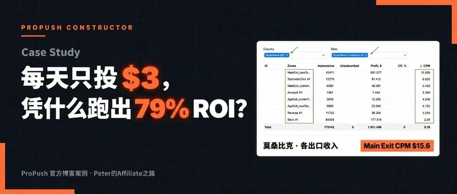
Last issue was about getting to 79% ROI on $3 a day. This one goes the other way: what it looks like when an edit breaks things.
| Change | Revenue change |
|---|---|
| Made it cleaner | −10% |
| Switched to a sports theme | −35% |
| Added survey questions | −18% |
| Changed only the visuals | −6% |
Test setup
| Metric | Value |
|---|---|
| Landing pages | Ready-made Constructor templates |
| Types | Clicker, multi-step survey, Social |
| Comparison | New version vs original (control) |
| Fastest stop | 2 hours after launch |
| Cases | 6, clients and offers not named |
Data from the official ProPush blog, published August 25, 2026. The four numbers above are each case’s revenue change, new version vs original.
01 Why you test when you edit a landing page
First, a quick word on Constructor: it’s ProPush’s landing page builder.
It’s full of ready-made landing pages that already work, with offer mechanics that have been validated. You host them yourself, tweak them with the AI assistant, and you can be running traffic in 1–2 hours.
The way it’s designed, if you run them as they are without changes, revenue is fairly stable.
But a lot of affiliates add their own copy, swap the design, add funnel steps and retention mechanics.
Once you change something, you have to test it. Testing is a craft, and even the strongest media buying teams get tests wrong.
It’s just that with landing page tests, what people in the industry show off is mostly the one time it went positive. Hardly anyone talks about the ones that lost money.
02 Cleaner doesn’t always mean more money
There was an offer that already worked. Its landing page had an element that, after users completed certain actions, sent them to an extra monetization zone.
He found it distracting and made two cleaner versions: one simplified it, the other removed it outright. The bet was that a smoother experience would convert better.
Both versions lost:
| Version | What happened |
|---|---|
| Original | Has a redirect element: after certain actions, users are sent to an extra monetization zone |
| The two cleaner new versions | Revenue −10%, impressions in secondary monetization zones −11–12%, main flow conversion barely moved |
What got removed was an extra source of revenue, and nothing elsewhere made up for it. The bottleneck in the main flow was never about how complex the page was.
The simplified version wasn’t thrown away. It stays in the system for testing the quality of new traffic sources, but it doesn’t run main traffic and doesn’t go into whitelist campaigns.
A mechanic that looks ugly often performs better than a pretty one.
Before you delete an element that looks unnecessary, check how much revenue it brings in.
03 Only the theme changed
This case is from the entertainment vertical. He had a classic clicker landing page: users click a few elements on the page and move on to the next step.
It was peak season, so he switched it to a sports theme, hoping seasonal visuals would lift engagement. The core mechanic stayed the same.
Here’s an example of a sports-themed landing page:

Sports-themed landing page example
The test ran for only 2 hours before it was stopped. Every step of the funnel was leaking:
| Stage | Change |
|---|---|
| Users who started the survey | −26% |
| Survey takers who reached the main exit | −35% |
| Revenue | −35% |
The original worked because clicking again and again to build up points had a game logic to it. Users could see their progress, knew why they were clicking, and felt in control.
With the sports theme, the same clicks felt random, and users didn’t understand what they were clicking on. The new welcome page also did a weaker job than the original of pushing people forward.
A mechanic that works can’t be moved into a new theme as is.
When the visuals change, the interaction logic has to be rethought along with them.
ProPush’s Sales Director, Karina Arkhangelskaya, said it was a good thing they ran it small for 1–2 hours first; that’s what stopped a money-burning test from running any longer.
Her advice: before scaling up for real, always leave an hour to warm up.
04 One extra question
This time it was a multi-step survey offer. Two versions were tested at once: one sped up the timer, the other added questions at the start of the survey.
The idea was that more questions mean more touchpoints and higher engagement, and that traffic could be segmented more finely early on.
Results for the two versions:
| Version | Result |
|---|---|
| Extra questions | Revenue −18%, age exit traffic nearly doubled, TabUnder got cut off, users reaching the main exit −30% |
| Faster timer | Revenue +2%, unstable across monetization zones |
The age question was moved to the first step. The age exit did get more traffic, but the extra questions pulled some users’ attention away, and the very first click is what triggers the core monetization.
One monetization zone earned more, the other two earned less, and overall it was a loss.
Add a step in the middle of a funnel and the side effects are hard to predict. Don’t look only at that step’s conversion; look at what happens to the traffic before and after it.
Change one variable at a time.
That’s Karina’s advice. Change the timer, the number of questions and the question order all at once, and you have no way of telling which change broke things and which one rescued them.
One test checks one hypothesis. Want to change three things? Test three times, in order.
05 Looks the same, performs differently
Four design versions were made for the same clicker landing page. Structure and game mechanics were almost identical; the only differences were visual: background color, the clickable elements and the overall style.
An example of a clicker landing page:

Clicker landing page example
In one version, the stones changed color when clicked, and revenue came in 6% below the control.
Two other versions looked almost the same as the winner, yet their results were noticeably worse. And the winner only beat the original by 2%.
Why the color-changing version lost: the spot where a stone lit up was slightly off from where the user clicked. It was barely noticeable, but it threw off the clicking rhythm.
About 80% of this landing page’s revenue comes from the main exit, so when the completion rate drops even a little, a real chunk of revenue goes with it.
There was also a Social landing page case that tripped over details.
The team added a pre-popup with a routing question, also made a simplified version without the popup, and tested both against the original.
Both new versions clearly lost to the original, and the test was paused quickly. Looking back, the next-step button in the new versions had actually gotten smaller, and the person in the new creatives didn’t grab attention the way the original did.
The two cases side by side:
| Case | Result |
|---|---|
| 4 design versions of the clicker | Color-changing stones version −6%, the winner only +2%, 80% of revenue from the main exit |
| The two new versions of the Social page | Users reaching the end −55–60%, next-step button a size smaller, person less eye-catching than in the original |
Button size, contrast and whether the image catches the eye sometimes matter more than the design logic.
On clicker landing pages that come down to how fast people tap, every detail is tied to money.
When you edit a landing page that works, don’t edit away the thing that makes it work, even if you can’t explain why it works.
06 Lost twice? Don’t rush to throw it out
This client made a new version of a landing page, and it lost the very first test. The team redesigned it and tested again. Here’s how the whole thing went:
- First test: users reaching the main exit were only half of the original's
- Redesigned and retested: overall monetization still lost, users reaching the main exit −33%
- Broken down by traffic source: on individual traffic sources, the gap almost disappeared
- Switched to the CPA model: the new version won and got its own slice of traffic to run on
At first glance it lost twice in a row. Look closer and the test told the team this version suits a certain type of traffic. Had they thrown it out after the first loss, they’d never have reached that conclusion.
Losing on average doesn’t mean it’s useless.
Break it down by traffic source, GEO, CPA model and traffic type, and some slice of it may well be winning.
Don’t delete landing pages that lost their tests either; keep them as a library of hypotheses. Six months later the traffic environment has changed, and an old landing page you kept might suddenly work.
07 ProPush’s 10 tips
- Always keep a control running: without a control, seasonal and traffic shifts distort any comparison.
- Test-run for 2–4 hours first: if it's already down 30% early on, you can stop it.
- Look at the whole funnel: a drop can happen at any step, not just in final revenue.
- Break down the results: a loss on average may be a win in a certain GEO, traffic source or device.
- Check for traffic anomalies: one bad traffic source is enough to skew the whole test.
- Test only one variable at a time: otherwise you don't know what caused the result.
- Wait for significant data: if the sample is too small, it's just noise.
- Don't throw out losing tests right away: they may work in some segment later.
- A better experience doesn't mean better monetization: count what you gain and what you lose together.
- Figure out why it won: only when you know the reason can you replicate it.
08 My take
Looking across the 6 cases, most of the failures came from small changes. A new theme, one extra question, a stone lighting up slightly off, a button a size smaller, and results drop by a big chunk.
So run small for a few hours first and always keep a control running. Those two cost the least, and they’re the first things to get right.
As Karina put it:
The best insurance is to always keep a control running while you test.
Without a control, you won’t catch an early drop. All you can do is compare against historical data, and historical data has long since been skewed by seasonality, traffic shifts and a pile of other factors. With a control, you know within two or three hours that something is off.
The idea behind Constructor is to use ready-made landing pages that already work to get traffic running as fast as possible, and earn average-level returns on ordinary offers and segments.
To go higher than that, you have to make your own changes, and once you change something, you have to test it.
The teams in these 6 cases lost money several times and kept testing anyway, and today their returns on Constructor are still above average.
Now that AI can generate landing page variants directly and the design step has shrunk to a few minutes, stopping after a single loss makes even less sense.
Community members who have traffic and want to try this can open Constructor in the ProPush back end, pick a ready-made landing page and get it running first, then add a control and test it bit by bit.
These cases come from the ProPush blog and are published in partnership with ProPush.
Income and ROI figures here are past results of one person or case, not typical outcomes. Paid traffic can lose money; start with a small test budget.
Translated from the Chinese original published on 2026.10.05.